Arrow Flash (1990)
This is not one of the MD's more fondly-remembered shooters these days and it's not one of my favourites either, if I'm honest. But it does have some pretty interesting cover artwork. Both actually have similar designs depicting a brave female mecha pilot apparently floating, one in orbit, the other over a cityscape, but both in front of their big mecha ship thing, though the Japanese one seems to be partly faded out. Both use the same logo/font too, but the art styles are very different as you might imagine, with the European cover using a Western comicbook style while the Japanese example unsurprisingly uses an anime style. Which is best? I suppose that depends on which style you prefer. I think I like the European one more, mainly because it shows the mecha properly, and the planet with presumably-hostile aliens in the distance is cool/foreboding, but both are pretty good. There is actually a third cover for the US version which is decent too. (full review here)


Shining Force (1992)
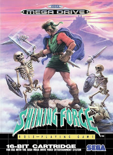
To my shame, I've never actually played this much-revered RPG (although, in my defence, if you can call it a defence, I didn't play any RPGs on my MD), but that shouldn't prevent me from being able to appreciate its cover artwork (or not). As with Arrow Flash, and no doubt many other MD games, it involves a Western comicbook style for the European release and anime stuffs for the Japanese one. I assume the latter is original artwork since I don't believe the game is based on an anime or something, but in either case it's certainly more action-packed then the Euro one, featuring a multitude of characters, presumably ones from the game, in striking action poses while a couple of sinister-looking oafs lurk shrouded in the background. The cover that greeted our shelves here in the UK features only a solitary hero defending his position on what appears to be a rocky outcrop from a pair of pesky skellies. The background is much better on this cover with it's winding mountain road leading to what I assume is a mountaintop fortress of evil, but I don't think the stoic warrior can win against the party of anime heroes. Despite that, I think I prefer the Western cover by a small margin, but this one is close! What do you think?


Ecco the Dolphin (1992)
I guess this must be one of the MD's most well known games but it has always been a bit of a polarising one too. I thought it was wonderful until I discovered how teeth-knashingly frustrating it is, but there can be little argument that it looks exactly as nice as its cover artwork indicated. Both versions are similar in that regard, depicting a majestic dolphin leaping out of its watery home, perhaps in a desperate attempt to avoid being the dinner of the shark that lurks nearby, but for some reason Sega of Japan decided to minimise this delightful imagery with a large white border. That makes the winner here clear, but even if both (or neither) covers had borders, I think I prefer the artwork on the European release anyway. (full review here)


Bio Hazard Battle / Crying (1992)
What a peculiar one this is. The game is a horizontal-scroller which sees you cleansing some planet of filth after a bio-weapon was used there during a previous war. This makes the European name and cover artwork very appropriate. It also makes the Japanese name and cover artwork mystifying. I guess I should assume there's something in the instruction manual that makes it seem less weird but who knows? In the absence of any explanation, however, the winner is clear for this game.


Alisia Dragoon (1992)
Last but not least for this round, another one with art styles exclusive to the regions of release. Despite the appeal of anime artwork, I think I prefer the European cover for this underrated game though. The main reason for this is that the Japanese artwork just looks like a jumble of bright colours unless you actually spend time looking at it closely. This reveals, in accordance with the game itself, a young scantily-clad lady (Alisia, presumably) doing some sort of wibbly magic gesture, three writhing dragons, and an angry-looking chicken or something. There's also some evil-looking guy's face in a circle and various floopy magical things going on in the background. The quality of the artwork is excellent, of course, and in some regards more closely matches the game (not least Alisia herself); I just wish the colour choices were better, or at least more varied. The Western cover might be of lower artistic quality but it's much clearer and that kind of thing makes a difference when scanning game shelves in shops as many of us used to spend so much time doing. Yes, Alisia looks less like her game self, and there's only one dragon, but we get some landscape, some enemies, and even a lightning magic, albeit completely missing its target. Unless there's another unseen enemy approaching. Both covers are good in their own ways but I think the Western one works better as an actual game cover. If anyone still reads this page, however, I'm sure you'll tell me I'm wrong! (full review here)


Look out for some more fantastic/dull/scary/horrifying Mega Drive covers soon!

No comments:
Post a Comment