Ace of Aces (1990)
By: Artech Digital Entertainment / US Gold Genre: Simulation Players: 1 Difficulty: Medium
Featured Version: Sega Master System
Also Available For: Atari 7800, Atari 8-bit, PC, MSX, Commodore 64, Amstrad CPC, ZX Spectrum
The two games I've covered for this feature so far have been pretty stinky and they were both stricken with bad reviews in their day but neither received such a shockingly awful score as to fill me with the kind of unbridled fear that might be felt when surrounded by hungry zombies. This poor old Master System game did. I forget the exact magazine in question now but I do have a distinct memory of this game receiving a score of 15%. Considering that most game magazines had (and still have) a tendency to rate games on a scale of 50 - 100%, with average games receiving around 75%, a score as low as 15% was a real shock. Can any game really be that bad? Considering I actually quite enjoyed this game on my Speccy (albeit briefly), I'm very interested in finding out...
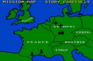
Actually, this game has the possibly dubious pleasure of being the first 'flight sim' reviewed here at Red Parsley, and on paper it sounds good. You play the part of a combat pilot in command of a Hobson FB-61 fighter (which I believe is fictional) during the Second World War. You have four missions which include dog-fights with enemy bombers, taking down V-1 bombs, stopping munitions trains, and bombing U-Boats, and they can be tackled in any order you like. Before each mission you'll get a short briefing which includes the approximate position of your target, the type of weapons you'll have access to, and the weather conditions, and you'll have to load your plane with ammo and fuel before you take off.
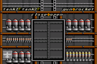
The ammo comes in the form of bombs, rockets, and cannon rounds, and you can choose how much you want of each. Once you're in the air, you can switch between four views - straight ahead looking out of the cockpit which is obviously where you control the plane from, left or right over each wing which is where you can alter speed and twiddle several other knobs, or below where you can view your weapon inventory and, when the situation requires it, open the hatch and drop bombs. You can also refer to a map of the relevant area at any time. As I said, it all sounds pretty good on paper (or writing on screen). The prospect of controlling a lone Allied fighter over Nazi-occupied France, hunting down the heinous enemies, and doing your bit for King and country sounds pretty appealing, and the game promises the kind of depth that few Master System games of this type offer.
Unfortunately however, as the aforementioned magazine indicated with its rather harsh score, it's not been executed in a particularly skilful manner. The first problem is the supremely repetitive graphics which primarily consist of a perpetual blanket of white and grey clouds. With no points of reference on the landscape and with an immensely slow sense of speed (not to mention ultra-jerky scrolling), this can be a very boring game for the sometimes-long periods spent searching for things to shoot at, and it can also make finding them tricky too. The presentation screens are pretty good though and most of them have short ditties. These screens are the only ones with music however, as the game is nearly silent save for the constant hum of the plane's engines (which you can accidentally stall as I discovered, so be careful!).
I also initially liked the different views of the plane. It's a nice novelty to start with, but in practise it doesn't really work very well. It's far too fiddly switching from one screen to another adjusting various switches, and in the heat of battle it's not realistic to even try. Sometimes you won't even know you're in a battle until it's too late. For example, one minute you could be rummaging around in your basement, organising your missiles and the like, and then suddenly there's a funny noise, a bit of shaking, and you've shot down! Control of the plane is very sluggish as well. Just taking on an enemy fighter is a painstaking chore - trying to keep the enemy in your sights feels like you're trying to heave a 747 around!
Oh well, at least we were given ample warning. Ace of Aces has some great ideas but it, and especially this version (I maintain that the Speccy effort isn't too bad), has forgotten to tie them all together with a decently designed game. What has been cobbled together is unfortunately boring, frustrating, lacks variety, and worst of all, there's just no compulsion to continue playing as the game gives the impression that you've pretty much seen it all within a very short while. I think the magazine score quoted at the beginning of this review is overly harsh - if you've got a lot of patience and like the subject material you may get some enjoyment out of this game, but most of us will probably give it ten minutes before forgetting about it and moving on to something else.
RKS Score: 4/10


Good review. The way you have described it reminds me a great deal of a game called "Dive Bomber" that I had for the Apple IIC when I was a kid. Almost exactly the same, right down to the frustration of being shot down while you were looking at a map or something!
ReplyDeleteI remember spending quite a bit of time playing it (I didn't have many games so even crap ones got a fair bit of use) and most of the time was spent flying around looking for the Bismark, which you were supposed to bomb. Very very frustrating and difficult game. I can't believe there is another one out there almost exactly the same!!
Wow, really? Who was it by? Maybe it was a prequel or something. I swear I remember enjoying this game on my Speccy. I'll have to play that version again and see if I was just having a funny five minutes :P
ReplyDeleteJust looked it up, here is a brief blurb about it:
ReplyDeletehttp://pcmuseum.ca/details.asp?id=38643&type=Software
I guess it was called "Night Raider" in Europe. I have some fond memories of it, actually.
Thanks for that, it actually looks better judging by the screenshots, although I suppose that's not always a wise thing to do! :P
ReplyDelete