
Space Harrier (1986)
As one of the early flagship titles for their console, it's a wonder that Sega didn't make more of an effort for its cover outside of Japan. There's a lot of empty space with the green dragon merely peering around the edge of the cover and getting a blast in the face for his troubles! That said, it is at least recognisable to fans, but just look at that Japanese cover - it's fantastic! It features a nice representation of the landscape, a couple of great-looking dragons, and even that splendid mammoth fellow from the title screen!


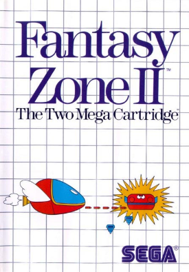
Fantasy Zone 2 (1987)
Pretty much the same situation as Space Harrier here. Most of us got this very plain looking cover with an extremely basic indication of what the player can expect, and that's either a miniature base or Opa-Opa is way too big. The Japanese cover, on the other hand, is near-enough flawless. It features lovely artwork and has a lot of detail, plus it shows everything that awaits the player. And check out that green guy at the bottom!

Action Fighter (1986)
Whilst neither cover here hints at the overhead-viewed nature of the gameplay, they do both give an indication of the road-based action, but which would tempt you to buy it first? The terrible UK/US cover is lazy at best while the Japanese one gives a great sense of the exciting racing action within. No contest...


Power Strike / Aleste (1988)
Wow, what's this?! As well as being a superb shmup, the Master System's best in my view, Power Strike receives almost exactly the same cover art as Aleste! The Japanese version is still better, of course - it shows a little more (including an impending missile strike) - but this is one of the finest Master System covers to be found outside Japan!


Alex Kidd in Miracle World (1986)
Oh dear, didn't last long, did it? We in the UK and US had to put up with yet another plain cover, this time featuring a possessed-looking (and blond) Alex who can be seen punching... nothing... with his weird club-hand while the splendid Japanese original features Mr Kidd as he really looks in the game and backs it up with a nice selection of enemies all trying to get a piece of him! Another superb Japanese cover...


So, I guess I needn't ask this question really, but which covers do you prefer? I've never understood why the Western arms of big Japanese games companies don't just copy the original artwork. It would save them time and money, plus surely they'd appeal to shoppers more? Oh well... I'll try my luck with cover comparisons for a different system next! Keep yer peepers peeled ;)
God, this post serves, once again, to remind just how terrible Sega's NA Master System box covers were. I'm not sure the system and its games ever had a chance against Nintendo's juggernaut, but the odds would have greatly improved, IMO, if they hadn't used such cheap-looking cover art in the US. Like you, I wonder why they didn't just re-use the Japanese art!
ReplyDeleteYeah, it defies belief, doesn't it?! The Japanese covers look so lovely, I haven't seen a single bad one yet. I remember thinking, even back then when I had no frame of reference, that the covers in UK gaming shops were a bit crap. Some of them look like primary school drawings! :|
ReplyDeleteAs an Amiga gamer I used to always laugh at the box art of these games - great to see them again all these years later and yes! They are as bad as I remember!
ReplyDeleteNice article mate.
"Some of them look like primary school drawings!" That's it exactly. The worst part of it is that some of these games -- many of them, in fact -- were good ones. Few people cared, though, thanks to the horrible cover art.
ReplyDeleteThanks, Retro Brothers! :)
ReplyDeleteYes, you're right, Bryan. When I was younger and saw these games in shops, I just assumed they were as basic as their covers. It was only later when I saw reviews in magazines and stuff that I realised some of them were great. Poor show, Sega :|
Nice post.
ReplyDeleteThe contrast between the two Action Fighter covers is the most astonishing. You can barely even tell it is a racing game on the one on the left.
Its quite the mystery. I mean, they already had these great illustrations from the Japanese release just lying around, why didn't they use them? Wouldn't have cost them anymore, unless they only had a license to use the images on the Japanese release (which I doubt).
Yeah, it's truly baffling. I can't see why an image would be licensed for use in one country only. With some systems, the companies alter the artwork in an attempt to appeal to different territories, but who do these MS covers appeal to?
ReplyDelete